
Pro sports once featured such festive mascots as a batting bird, a happy native, a deer spinning a basketball, siblings shaking hands, an athletic elephant, Mr. Met, and Brownie the elf. The cheerful symbols depicted the recreational nature of the games they represented.
Somewhere along the line, it became unpopular to be playful and fun, and everything started to look darker, with less color. Once-friendly mascots started to look like they were infected with rabies, and it seemed to be a requirement to have a sleek, mean, cold-feeling logo.
Fortunately, minor league baseball is one area that not only seems to be exempt from this unwritten rule, but actually flourishing with fun. The logos and uniforms are lively and quirky, and the team names themselves are much more creative and unique. Professional sports at the top level seems to be above choosing names that are playful, instead choosing much more neutral, boring, and overused nicknames.
Here are the top 10 most fun minor league identities. We're not necessarily recognizing the most technically brilliant graphic designs. Most of these tend to be illustrative or cartoonish in nature, but that's okay. Its a game after all, and we want to have fun while we wear fruit on our caps.

Far and away the most fun and playful, yet cleanly executed identity. Adopted in 2005, the team name was selected to reflect the many different types of nuts grown in the region. Even more fun is the application of the name. The club wears a peanut on their cap at home, and a walnut on the road. All parts of this identity are executed well.
California League
Level: High A
Affiliate: Oakland Athletics

2. Montgomery Biscuits
A staple of southern food, the Biscuits take full advantage of the marketing power of their nickname since 2004. Chants of "Hey, butter, butter, butter..." can be heard in the stands while biscuits are shot from a cannon. Fans can pick up their favorite team gear from the souvenir store: the Biscuit Basket. The logo featuers an open-mouthed, bug-eyed biscuit, complete with a slice of butter as the tongue. While the logo is fun, both the type and the mascot leave a little something to be desired. The wordmark is a little weak, and hard to read, while the drawing of the biscuit could be stronger. Even so, its a great identity program for the fun factor alone.
Southern League
Level: Class AA
Affiliate: Tampa Bay Rays

3. Lansing Lugnuts
Home to the Lugnuts since 1996, Lansing is the home of General Motors. Thus, its fitting that the team would adopt an automobile identity. The mascot here is a disoriented hex screw, who seems to be dizzy from spinning too many times. The type of the wordmark is very quirky, but unique, and adds to the purposefully haphazard look to the identity.
Midwest League
Level: Class A
Affiliate: Toronto Blue Jays

4. Casper Ghosts
Many minor league teams seem to want to establish identities of their own, different from the Major League teams they are affiliated with. In 2008, the Casper (Wyoming) Rockies adopted the Ghosts as their nickname, in honor of Casper the Friendly Ghost. An overly fierce-looking ghost sits top the ghoulish type. Does it need to be so mean looking? I thought our favorite phantom was friendly? The ghost itself is rendered using a dot screen, an interesting application of a printing method. The cap logo actually uses glow-in-the-dark thread, a nice added touch. The club also uses the image of Casper the Friendly Ghost as an alternate logo with permission from Classic Media.
Pioneer League
Level: Advanced Rookie
Affiliate: Colorado Rockies
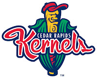
5. Cedar Rapids Kernels
Another agricultural-based nickname, the Kernels adopted their nickname in 1993. The logo features a hatted baseball bat sprouting from a corn husk. The script is nicely drawn, and the composition of the city, nickname, and mascot come together in one of the more neatly-organized examples. The club also has an alternate cap logo that nicely entangles the C and R initials.
Midwest League
Level: Class A
Affiliate: Los Angeles Angels of Anaheim

6. Jamestown Jammers
Nothing like an angry (though anything but sleek and macho) bunch of grapes to strike fear into the opposing team. The Jammers' caps sport both the red (home) and white (road) varieties. Adopted in 2006, the mascot was chosen to reflect the strong tradition of grape-growing in Chautauqua County. While the mascot is fun, its interesting that he is just overlaying the bat, instead of interacting with it. The typography is flat out bad, as the letters are poorly drawn, and the blue and green are too close to the same value to be legible.
New York - Penn League
Level: Short-Season A
Affiliate: Florida Marlins

7. Lowell Spinners
Founded in 1996, the Spinners were named from the hometown history as a manufacturing center for textiles. The cap logo is thread wrapped around a bat, but it also forms the letter S as it wraps around. A very clever and nicely-executed idea. Unfortunately, the main wordmark is not so successful. It uses the same thread and bat, but does not include the S. Instead, it uses a very generic and ugly serif font spell out the team nickname. Its a shame that a team with such a neat name and mark should suffer from this. I'm also not sure what is going on with the alternate logo. It looks like it is trying to adopt the previous mascot, which really isn't a good idea. Both look like they were drawn using MicroSoft Paint by an amateur. If using the former mascot was a requirement, the very least they could have done is touch him up a bit.
New York - Penn League
Level: Short-Season A
Affiliate: Boston Red Sox
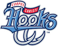
8. Corpus Christi Hooks
The entire identity of the Nolan Ryan-owned Hooks is based around the marine lifestyle of the popular south Texas fishing town. The dual blue colors are meant to represent the ocean and sky. A pair of hooks doubles nicely the initials CC, while the eyelets become the double O in the wordmark. The full city name and Texas flag are unnecessary clutter, especially since the city is already represented by its initials. The team also features a secondary mascot on its caps, a squirmy capped hook cartoon wielding a baseball bat. All in all, a solid identity top to bottom.
Texas League
Level: Class AA
Affiliate: Texas Rangers

9. Richmond Flying Squirrels
Formerly the Connecticut Defenders, the Flying Squirrels will begin play in 2010. The nickname was chosen from a name-the-team contest late last year, though it doesn't appear to represent anything in particular. The primary logo is acceptable, though it seems to suffer from sleek and mean syndrome and has a superhero look to it that resembles the Akron Aeros logo. The script is tough to look at, as the negative and postive spaces in the letterforms really clash. The 'FLYING' text is set in the terrible Wide Latin system font. It should be scrapped entirely. The redeeming aspect of the identity is the alternate mark, an acorn with a letter R, which front leg becomes a squirrel tail.
Eastern League
Level: Class AA
Affiliate: San Francisco Giants
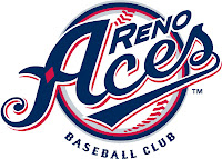 10. Reno Aces
The Aces began play in 2009, their nickname and obvious play to their gambling hometown. Although the navy, red, and grey colors look very sharp, its curious that the team colors are not red and black. The pimary mark has too much going on, as it tries to bring together the script, a baseball, the city name, and the words 'Baseball Club' underneath. The elements work much better on their own. Despite these successes, I can't help but feel that something more could have been done with this identity. We see the diamond on the letter A, but it seems to be just sitting there. The spade shows up in the secondary mark, but its just placed in the middle. The elements could interact with each other in a much more interesting way. Perhaps reversing the A out of the spade? We also see nothing of the heart or club anywhere in the identity. Its not bad overall, but it could have been much better.
Pacific Coast League
Level: Class AAA
Affiliate: Arizona Diamondbacks
Honorable Mention
Rancho Cucamonga Quakes
The Quakes have been around since 1993, and have always been one of my favorite minor league identities. They've always featured a wordmark that is split over a faultline. The Q also works well on the cap by itself. A nice execution brings several elements together into an all too often used seal.
Fort Wayne Tin Caps
Another produce-themed mascot, the Tin Caps have been around for 2 years now. Its a fun theme with a great devious mascot. The type looks like its supposed to be sheets of tin nailed to the wall. While it is a nice attempt at creating a unique wordmark, it looks amateurish in a bad way.
Albuquerque Isotopes
The fictional Springfield Isotopes from the long running TV series The Simpsons were the influence for the name of the team, from an episode where Homer attempts to thwart the team's plan to move to Albuquerque by going on a hunger strike. The logo features baseballs orbiting around the letter A in atomic formation.


