November 2, 2012

Ranking the Major League Brands


Major League Baseball has two advantages working for it to help build strong brands. First, it is by far the oldest of the major sports leagues, giving it a deeper and richer history to draw from. Second, the baseball cap itself is a versatile fashion accessory, allowing it to transcend its traditional role as a part of the uniform and become ingrained as a cultural icon.

Toronto Blue Jays
Toronto still think its the 1990's, when every team was adding black and silver to their uniform. How a team with blue in their name fails to wear blue uniforms, or at least blue hats, is baffling. However, the biggest tragedy here is that the Jays had a very unique and effective system the first 20 years of their existence. It featured 3 shades of blue in the uniform and logo, and it remains so popular that the club has started wearing the powder blue versions again as an alternate. Clearly the logo is still popular with the fan base, and it was also the identity the club wore throughout its winning years in the 80s and early 90s. Its time for Toronto to ditch the current scheme (including the toothpaste away caps), and reinstate the proud Jay of the winning years.
Primary Logo - 2
Cap Logo - 3
Uniforms - 2
Uniqueness - 0
Total - 7

Colorado Rockies
A product of mid-90's expansion, the Rockies were doomed from the start as they are a double-offender with both black and silver in the identity, The purple may be ugly, but at least its unique and fitting, as it is the apparent color of the Rocky Mountain range. While the cap logo is decent, the entire system is plagued by an ugly thick stroke that makes all the letter almost unreadable. The uniforms are downright schizophrenic, as they include team name/city, numbers on front, pinstripes, sleeve stripes, AND a shirt/vest combination that doesn't match the pants whatsoever. The primary logo could be worse, but also tries to do too much. The team should start fresh with a nicely drawn lettering, and build a simpler system around it.
Primary Logo - 3
Cap Logo - 5
Uniforms - 2
Uniqueness - 1
Total - 11

Milwaukee Brewers
The Brewers are another frustrating identity mostly because, like the Blue Jays, they have such a wonderful logo buried in their archives. While the current system is unmemorable and boring, both the home and away scripts are very nicely drawn. Combine those with the infamous MB glove logo of the 80's, one of the most clever logos in the history of sports, and they'd have one one heck of a branding scheme. The roundness of the script plays well against the rounded forms of the glove as well, so the two wouldn't feel foreign against each other. It could work just as well with the current navy and gold color scheme as it would with the similar royal and yellow colors the club previously featured.
Primary Logo - 5
Cap Logo - 4
Uniforms - 4
Uniqueness - 2
Total - 15

Arizona Diamondbacks
Arizona gets some credit for abandoning the putried scheme they had their first 9 years in the league. While the new system is light years better, its not very unique. They are following the newest trend of having either red or navy, combining it with black from the last trend.
Primary Logo - 5
Cap Logo - 7
Uniforms - 6
Uniqueness - 2
Total - 20

Kansas City Royals
Primary Logo - 6
Cap Logo - 7
Uniforms - 6
Uniqueness - 1
Total - 20

Washington Nationals
Primary Logo - 5.5
Cap Logo - 9.5
Uniforms - 7
Uniqueness - 4
Total - 21

Texas Rangers
Primary Logo - 3
Cap Logo - 7
Uniforms - 8
Uniqueness - 3
Total - 21

Pittsburgh Pirates
Primary Logo - 1
Cap Logo - 8
Uniforms - 8
Uniqueness - 5
Total - 22

Minnesota Twins
Primary Logo - 6
Cap Logo - 8
Uniforms - 7
Uniqueness - 1
Total - 22

San Diego Padres
Primary Logo - 6.5
Cap Logo - 8
Uniforms - 7
Uniqueness - 1
Total - 22.5

Tampa Bay Rays
Primary Logo - 7
Cap Logo - 7.5
Uniforms - 7
Uniquenesss - 2
Total - 23.5

Florida Marlins
Primary Logo - 7
Cap Logo - 8
Uniforms - 7.5
Uniqueness - 2
Total - 24.5

New York Mets
Primary Logo - 6
Cap Logo - 8.5
Uniforms - 8
Uniqueness - 4
Total - 26.5

Seattle Mariners
Primary Logo - 7.5
Cap Logo - 8.5
Uniforms - 8
Uniqueness - 3
Total - 27

Baltimore Orioles
Primary Logo - 7
Cap Logo - 8
Uniforms - 8.5
Uniqueness - 4
Total - 27.5

Atlanta Braves
Primary Logo - 7
Cap Logo - 8
Uniforms - 8
Uniqueness - 5
Total - 28

Oakland Athletics
Primary Logo - 7
Cap Logo - 7.5
Uniforms - 9
Uniqueness - 5
Total - 28.5

LA Angels of Anaheim
Primary Logo - 8.5
Cap Logo - 8.5
Uniforms - 8
Uniqueness - 4
Total - 29

Philadelphia Phillies
Primary Logo - 7
Cap Logo - 8
Uniforms - 8
Uniqueness - 6
Total - 29

Chicago White Sox
Primary Logo - 8
Cap Logo - 8
Uniforms - 8
Uniqueness - 6
Total - 30

Cincinnati Reds
Primary Logo - 8
Cap Logo - 9
Uniforms - 7
Uniqueness - 6
Total - 30

Houston Astros
Primary Logo - 7.5
Cap Logo - 8.5
Uniforms - 9
Uniqueness - 6
Total - 31

Cleveland Indians
Primary Logo - 8
Cap Logo - 8
Uniforms - 8.5
Uniqueness - 7
Total - 31.5

San Francisco Giants
Primary Logo - 7
Cap Logo - 8.5
Uniforms - 8.5
Uniqueness - 7.5
Total - 31.5

Detroit Tigers
Primary Logo - 8
Cap Logo - 9
Uniforms - 8
Uniqueness - 7
Total - 32

Boston Red Sox
Primary Logo - 8
Cap Logo - 9
Uniforms - 9
Uniqueness - 7
Total - 33

Los Angeles Dodgers
Primary Logo - 7.5
Cap Logo - 10
Uniforms - 9
Uniqueness - 7
Total - 33.5

Chicago Cubs
Primary Logo - 9.5
Cap Logo - 9
Uniforms - 9
Uniqueness - 8
Total - 35.5

St. Louis Cardinals
Primary Logo - 9
Cap Logo - 9
Uniforms - 9.5
Uniqueness - 8
Total - 35.5

New York Yankees
Primary Logo - 7
Cap Logo - 10
Uniforms - 10
Uniqueness - 9
Total - 36

February 26, 2011

Inglorious Indians

This originally started out as a top ten list of players who made their careers on other teams, but stopped off in Cleveland along the way. However, after perusing every Indians roster since 1960, there were just too many to ignore. Some you may remember, some you may have forgotten, and some its just good to see in a Tribe uniform, even if it wasn't for long enough.


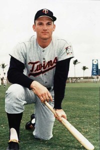
Roger Maris | 1957-58
Better known as: 2-time MVP, 4-time All Star, set all-time single season homerun record, number retired by Yankees.

Maris was already on his way to becoming one of the better power hitters in the American League, cracking 25 homers in 167 games as an Indian, but Cleveland shipped him off to Kansas City at the age of 23 for Woodie Held and Vic Power.


Hoyt Wilhelm | 1957-58
Better known as: Hall of Famer, 8-time All Star, 143 career wins, 227 career saves, 21 seasons.

The infamous knuckler stopped in Cleveland for a cup of coffee relatively early in his career at the age of 34. He appeared in 32 games, saving 10 of them, in just over a season with the Indians before being selected off waivers by the Baltimore Orioles.


Tommy John | 1963-64
Better known as: 288 game winner, played 26 seasons for 6 clubs, 4-time All Star, 4-time top 10 in Cy Young voting, namesake of now-famous arm surgery

Another budding young star the Indians sent packing, John was traded at age 21 after appearing in just 31 games his first two seasons in the big leagues. However, the trade brought the Tribe a young power hitting outfielder who would go on to become of the franchise's all-time greats – Rocky Colavito.


Lou Piniella | 1968
Better known as: 1969 AL Rookie of the Year, All-Star, World Champion player and manager, 3-time Manager of the Year.

Originally signed by the Tribe in 1962, Sweet Lou worked his way through the Senators' and Orioles' systems before being traded back to Cleveland in 1966. He appeared in 6 games, going 0-5 at the plate before being selected in the expansion draft by the Seattle Pilots. Seattle then dealt him to KC where he was named the AL's top rookie in his first full season.


Graig Nettles | 1970-72
Better known as: 6-time All Star, 2-time Gold Glove winner, 1981 ALCS MVP, 390 career homruns.

Brought to Cleveland in exchange for Luis Tiant, Nettles did have 3 solid full seasons in an Indians uniform and even managed to earn a single MVP vote (likely from a Cleveland writer) for a 28 homer / 86 rbi / .261 performance in '71. Nettles was dealt to New York in a 6 player trade where he would go on to become an All-Star, Gold Glover, and World Champion.


Chris Chambliss | 1971-74
Better known for: All-Star, Gold Glove winner, 2-time World Champion, walk-off homerun in 1976 ALCS

The Indians made Chambliss the number one overall pick in the 1970 draft, and he paid immediate dividends, earning the AL Rookie of the Year award just the next season. Two and a half seasons later the Indians traded yet another emerging young star to who else – the New York Yankees.


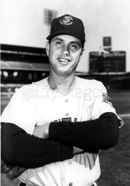
Dennis Eckersley | 1975-77
Better known as: Hall of Famer, 6-time All Star, Cy Young winner, Most Valuable Player, ALCS MVP, World Champion.

Tribe fans will remember as the rest of baseball probably forgets, but this image is always fun to look at. Before The Eck was a 'stached Hall of Fame closer, he was a clean-shaven starting pitcher who won 50 games in 3 seasons for the Indians. Eckersley tossed a no-hitter against the California Angels in 1977, and was traded to Boston for an underwhelming package the next spring.


Boog Powell | 1975-76
Better known as: 4-time All Star, 1970 AL MVP, 339 career homers, master BBQ'er.

Another player from the red-uniform era, Powell was at the opposite end of his career as Eckersley. Boog swatted 27 homers and drove in 86 runs with a .297 average in his first year for the Tribe, but he fizzled out and retired from baseball after 2 more unproductive seasons.


Bobby Bonds | 1979
Better known as: 3-time All Star ('73 All Star MVP), 3-time Gold Glover, father of Barry Bonds.

Bonds was acquired from Texas with pitcher Len Barker after the 1978 season, and would have his last productive season of his career in a Tribe uniform. He hit .275 with a .367 on base %, 93 runs, 25 homers, 85 RBI, and 34 stolen bases in 1979, and he would play two more partial seasons in the National League before retiring after the 1981 season.


Phil Niekro | 1986-87
Better known as: Hall of Famer, 5-time All Star, 5-time Gold Glover, won 318 career games over 24 seasons.

The Tribe signed knuckleballing Niekro at the ripe age of 47, where he produced a respectable 11-11 season in 34 games in 1986. After 22 games the next season, he was traded away, and would appear in just 4 more games before calling it quits after the '87 season.


Bert Blyleven | 1981-85
Rick Sutcliffe | 1982-84
Better known as: Blyleven - Hall of Famer, 2-time All Star, 3-time in top 5 MVP voting, 287 wins / 3701 strikeouts in 22 seasons. Sutcliffe - 1984 Cy Young winner, 3 time All star, 1979 NL Rookie of the Year.

CC Sabathia and Cliff Lee were not the only pair of aces pissed away in recent Cleveland memory. Blyleven and Sutcliffe had overlapping stints over 3 years in Tribe uniforms. The Indians dealt Sutcliffe to the Cubs midway through his Cy Young season for a package that included Joe Carter (who would later be traded for Sandy Alomar and Carlos Baerga). Hall of Famer Blyleven was shipped to the Twins for an unimpressive package that included Jay Bell, thus ending the best bearded 1-2 punch in baseball history.


Jay Bell | 1986-88
Better known as: All Star, Gold Glove winner, World Champion, sac bunt extraordinaire.

Bell was the key player in the deal that sent Blyleven to Minnesota, and the Tribe gave him a taste of the big leagues over 3 seasons. Still in his very early 20s, he was overmatched in his 350 at bats in Cleveland, and Bell was sent to the Pirates. The trade netted the Indians Felix Fermin, who was acceptable if unspectacular over 5 seasons as the Tribe's shortstop before being packaged in a trade with Seattle for Omar Vizquel.


Steve Carlton | 1987
Better known as: Hall of Famer, 4-time Cy Young winner, 10-time All Star, Gold Glover, 329 wins / 4,136 strikeouts in 24 seasons.

At the age of 42, Carlton's appearance with the Tribe was more about selling tickets than winning games. The Hall of Fame lefty managed just a 5-9 record in 23 games in a Wahoo hat before being traded to Minnesota, where he would appear in just 14 more games before retiring the next season.


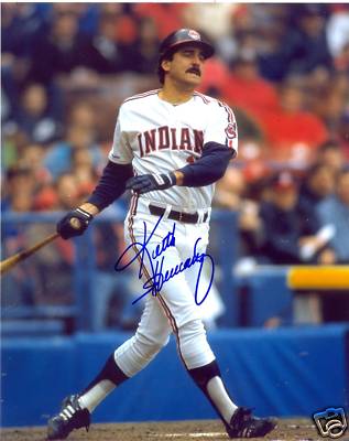
Keith Hernandez | 1990
Better known as: 1979 NL Most Valuable Player, 5-time All Star, 11-time Gold Glover, 2-time Silver Slugger, World Champion, Mets broadcaster, "I'm Keith Hernandez" quip.

Another misguided attempt by the Indians to sell tickets, Hernandez was coming off 2 injury-plagued seasons with the Mets, and clearly didn't much left in his legs. He batted an even .200 in 145 at bats in 1990 before ending up on the disabled list. Frustratingly for Cleveland, he talked them into signing him to a 2-year, $3.5 million dollar deal, and Keith spent the entire 1991 season on the disabled list.


Jack Parkman
Better known as: superstar catcher, his shimmy makes the women go crazy.

After getting knocked out of the playoffs last season, the Tribe acquired the power hitting backstop via free agency from the Oakland Athletics. However, Parkman's personality caused trouble in the Cleveland clubhouse, and he was dealt to Chicago mid-season.


Jack Morris | 1994
Better known as: 1991 World Series MVP, 5-time All Star, 5-time top 5 in Cy Young Voting, 254 game winner, possible future Hall of Famer.

As the Indians moved into a new home and their prospects were emerging as young stars, they signed a pair of veteran pitchers to balance out the roster in Dennis Martinez and Jack Morris. Just 3 seasons from throwing a 10 inning shutout to clinch the World Series and 2 seasons from winning 21 games, Morris looked like he still had plenty left in his 39 year old arm. However, he was not traveling with the team, instead returning to his ranch in Minnesota in between starts, and, even more troubling, Morris failed to sport his trademark mustache for the first time in his career. Despite a nice-looking 10-6 record, his ERA sat at an ugly 5.60, and Morris left the team for good in August in what would be his last Major League season.


Dave Winfield | 1995
Better known as: Hall of Famer, 12-time All Star, 7-time Gold Glover, World Champion, 3 sport star.

The Indians brought in Winfield to provide veteran leadership in a part time role, at a low cost in 1995. Just two years removed from a top 5 MVP voting performance at the age of 40, there was reason to believe that Big Dave might still have some big swings left. However, the sun had already set on his Hall of Fame career, as Winfield managed just two homers and a .191 average in 115 at bats in his final pro season.


Jeff Kent | 1996
Better known as: 2000 NL MVP, 5-time All Star, 4-time Silver Slugger, possible future Hall of Famer.

Kent arrived in Cleveland as part of a controversial trade in exchange for fan-favorite Carlos Baerga in the middle of the 1996 season. He was never welcomed with open arms by the fans, and never settled in at the plate, hitting just .265 with 3 homers in 39 games. Its hard to say the Indians made a mistake in not keeping him, as they traded Kent for Matt Williams (who would eventually be flipped for Travis Fryman), but he had a very productive second career that began at age 29 after the trade.


Kevin Mitchell | 1997
Better known as: 1989 NL Most Valuable Player, 2-time MVP, bare-handing hardass of an outfielder.

With Albert Belle gone, the Indians were looking to for a run-producing bat to help fill the void. Former MVP Kevin Mitchell, still hitting over .300 every season and only 3 years off a great performance in the strike-shortened '94 season seemed like a decent fit. However, one look at this picture tells you all you need to know. He was overweight and out of shape, and batted a measly .153 in 20 games before getting a pink slip just two months into the season.


Cecil Fielder | 1998
Better known as: 3-time All Star, 2-time silver slugger and top 2 in MVP voting.

With a lineup already stacked with power bats (Thome, Manny, Justice, Fryman, Giles, Sexson), the Indians really had no need or place for Cecil, but I guess they figured 'Why not?' Well, here's why: at 34, Fielder's career was already over, and he batted .143 with just one extra base hit in 35 at bats. Big Daddy didn't even manage to go yard for the Tribe, and became yet another former star to perform his swan song in Cleveland.


Harold Baines | 1999
Better known as: 6-time All Star, Silver Slugger, 2,866 hits in 22 seasons.

Another one of the Indians annual rented bats, Baines was in town only long enough to mess up Manny Ramirez's swing, just in time for the playoffs. In 28 games, Baines did hit .271 with a .354 OBP, but at age 40 managed just 2 doubles and a homerun in 85 at bats.


Dwight Gooden | 1998-99
Better known as: '85 Cy Young Winner, Rookie of the Year, 4-time All Star, World Champion, generous supporter of the coke business.

After a crushing defeat in the '97 World Series, the Indians called the Doc for help in 1998. Gooden was enjoying somewhat of a second career at the time, even throwing a no-hitter for the Yankees in '96. Dr. K would spend 2 injury plagued seasons in Cleveland, putting up a solid 8-6 record with a 3.76 ERA in 1998 before moving on for one last season with 3 clubs in 2000.


Chuck Finley | 2000-02
Better known as: 5-time All Star, 200 game winner, husband and punching bag of actress Tawny Kitaen.

As the 90's became the 2000's the Indians became more desperate to find quality arms to balance out their powerhouse offense, and the Tribe signed 37-year old Finley to a lucrative 3 year deal. Finley did make the All Star team his first season, winning 16 games despite an ERA over 4. After an injury shortened 2001 campaign and a 4-11 start in 2002, he was dealt to St. Louis for a prospect who would help the Indians' rebuilding efforts – outfielder Coco Crisp.


Juan Gonzalez | 2001
Better known as: 2-time AL MVP, 3-time All Star, 6-time silver slugger.

In 2001, the Indians were faced with the seemingly impossible task of filling the departed Manny Ramirez's spot in the heart of the lineup. But at 31 and coming off an injury-plagued season in Detroit, Juan Gone did just that. A case of one and done, Gonzalez would have the last great season of his career, belting 35 homers, driving in a whopping 140 runs and hitting .325 en route to a top 5 MVP finish and a Silver Slugger. The season would be the last hurrah of the Jacobs Field Era, as the Indians fell out of contention the next season. The Tribe hoped Gonzalez could recapture even fraction of the magic a few years later in 2005, but he recorded just one major league at bat before officially hanging up his needle...ERR... spikes for good.
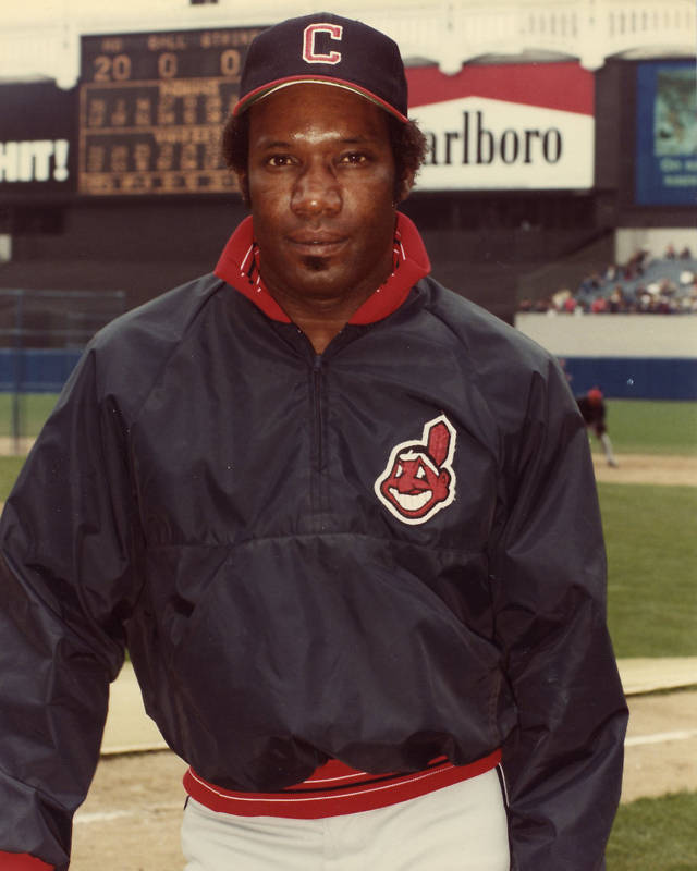


John Rocker | 2001
Milton Bradley | 2001-03
Better known as: loose cannons

Rocker and Bradley were a couple of high risk / high reward acquisitions as the Indians began the retooling process that eventually turned into a full-fledged overhaul. Fans wanted Rocker to be Rick Vaughn, as he came sprinting out of the bullpen to "Rock You Like a Hurricane", but he was too much hurricane and not enough rock. He'd blow 3 out of 7 save attempts and was traded after just a half season with the club. Bradley had a breakout season at age 25 in 2003, hitting .321 with 10 homers, 56 RBI, and 17 steals in just 101 games. However, management felt he was a bad fit for a young rebuilding club and sent the troubled future All Star to the Dodgers for Franklin Gutierrez.


Brandon Phillips | 2002-05
Better known as: All Star and Gold Glover for the other Ohio team.

Just the thought of him makes Indians fans sick to their stomachs. Phillips was acquired in one of the most lopsided trades in baseball history, which would bring the Indians 3 future All Stars – two of which were 5 tool players (Phillips and Grady Sizemore) and the other who would win a Cy Young Award (Cliff Lee) – in exchange for an a rapidly aging (and growing) Bartolo Colon. The Indians decided to rush Phillips to the majors at the young age of 22 for an almost full season. Clearly in need of more seasoning, he spent the next two seasons in the minors, and only saw 12 games at the Major League level. By age 25 he was out of options and the Indians had to decide to either keep their young 5-tool phenom or risk losing him to waivers. Evidently the Indians were so impressed with Ramon Vazquez they decided to keep him instead, and essentially sold their emerging star to the cross-state Cincinnati Reds. Phillips would immediately make good on all the hype and become one of the best young all-around players in the National League. Good work, Tribe.

August 13, 2010

The Magic of a Golden Jazz Logo

Its been a busy offseason for NBA rebranding, as 3 clubs have introduced new identities for the upcoming 2010-11 season. The Association must think its followers forget exactly what sport they're watching, as 19 of the 30 clubs feature a ball in some way in their primary logo (compared to 11 of 30 in baseball and just 1 of 32 in the NFL). When viewed as a group, the NBA logos don't stand much apart from one another, especially considering at least 9 of the logos don't even display any connection to the team nickname.

The most dramatic of the rebrands is the Golden State Warriors. The only good decision to come from the process was to get rid of the blue warrior (in front of a basketball, naturally) the team had featured since 1997. The new logo is an homage to 'The City' logo and uniforms from the late 60s/early 70s that have regained popularity in recent years. While the idea of paying tribute to the past era is valid, the execution is nothing short of a debacle. There is not a single redeeming quality about any part of the new logo. The bridge is poorly drawn, the outer strokes are unexplainably uneven and bottom-heavy, the type is dreadfully unreadable (Copperplate Gothic? Really?) With an already successful logo in its past, why not just bring it back in its original form? What is the need to change something that people clearly liked and enjoyed?

From the Shaq/Penny era, through the McGrady regime, to the current Howard age, the Orlando Magic have had one of the most recognized brands in basketball. Since the club's inception in 1989, the primary logo has featured a star replacing the 'A' and dotting the 'I' in Magic in two variations. However, for some reason the Magic have decided to abandon their most identifying trait in favor of... a basketball! The swooshing ball accompanies the new wordmark, which has been displayed on the jerseys since 2003. The move is probably meant to unify the entire package, but begs the question why the uniforms didn't match the logo in the first place. The previous mark was memorable and successful in its own way. A better approach would have been to just drop the basketball and put the starry Magic back across the chest, as they did up until 2003.

Luckily, the higher-ups in Utah recognize the value of brand equity. The Jazz are reintroducing the music note logo, marking the return of one of the most unique logos in all of professional sports. The logo remains in its original 1974 glory, with the exception of a faint grey outline and a color shift from purple to navy. The two changes update the logo in a very subtle way without altering the original intention. The only puzzling aspect of this rebrand is why the club is holding on to its mountain logo, which will see its third color scheme of the last 7 years. With such a great logo that has been present since the very beginning, having two logos only damages the brand recognition. Hopefully this will only be a transition period and the mountain logo will be phased out soon.

The move is similar to the 76ers move last year to ditch its overly-complicated late 90's rebrand in favor of the simpler logo the club had been using since day one. While the original logo is guilty of featuring a basketball, it does have uniquely quirkly typography and the ring of 13 revolutionary stars. Other teams would be better-suited to follow the example the Sixers and Jazz have set by reclaiming lost brands that had been abandoned in the past.

February 13, 2010

10 Fun Minor League Logos

Pro sports once featured such festive mascots as a batting bird, a happy native, a deer spinning a basketball, siblings shaking hands, an athletic elephant, Mr. Met, and Brownie the elf. The cheerful symbols depicted the recreational nature of the games they represented.

Somewhere along the line, it became unpopular to be playful and fun, and everything started to look darker, with less color. Once-friendly mascots started to look like they were infected with rabies, and it seemed to be a requirement to have a sleek, mean, cold-feeling logo.

Fortunately, minor league baseball is one area that not only seems to be exempt from this unwritten rule, but actually flourishing with fun. The logos and uniforms are lively and quirky, and the team names themselves are much more creative and unique. Professional sports at the top level seems to be above choosing names that are playful, instead choosing much more neutral, boring, and overused nicknames.

Here are the top 10 most fun minor league identities. We're not necessarily recognizing the most technically brilliant graphic designs. Most of these tend to be illustrative or cartoonish in nature, but that's okay. Its a game after all, and we want to have fun while we wear fruit on our caps.

1. Modesto Nuts
Far and away the most fun and playful, yet cleanly executed identity. Adopted in 2005, the team name was selected to reflect the many different types of nuts grown in the region. Even more fun is the application of the name. The club wears a peanut on their cap at home, and a walnut on the road. All parts of this identity are executed well.
California League
Level: High A
Affiliate: Oakland Athletics

2. Montgomery Biscuits
A staple of southern food, the Biscuits take full advantage of the marketing power of their nickname since 2004. Chants of "Hey, butter, butter, butter..." can be heard in the stands while biscuits are shot from a cannon. Fans can pick up their favorite team gear from the souvenir store: the Biscuit Basket. The logo featuers an open-mouthed, bug-eyed biscuit, complete with a slice of butter as the tongue. While the logo is fun, both the type and the mascot leave a little something to be desired. The wordmark is a little weak, and hard to read, while the drawing of the biscuit could be stronger. Even so, its a great identity program for the fun factor alone.
Southern League
Level: Class AA
Affiliate: Tampa Bay Rays

3. Lansing Lugnuts
Home to the Lugnuts since 1996, Lansing is the home of General Motors. Thus, its fitting that the team would adopt an automobile identity. The mascot here is a disoriented hex screw, who seems to be dizzy from spinning too many times. The type of the wordmark is very quirky, but unique, and adds to the purposefully haphazard look to the identity.
Midwest League
Level: Class A
Affiliate: Toronto Blue Jays

4. Casper Ghosts
Many minor league teams seem to want to establish identities of their own, different from the Major League teams they are affiliated with. In 2008, the Casper (Wyoming) Rockies adopted the Ghosts as their nickname, in honor of Casper the Friendly Ghost. An overly fierce-looking ghost sits top the ghoulish type. Does it need to be so mean looking? I thought our favorite phantom was friendly? The ghost itself is rendered using a dot screen, an interesting application of a printing method. The cap logo actually uses glow-in-the-dark thread, a nice added touch. The club also uses the image of Casper the Friendly Ghost as an alternate logo with permission from Classic Media.
Pioneer League
Level: Advanced Rookie
Affiliate: Colorado Rockies

5. Cedar Rapids Kernels
Another agricultural-based nickname, the Kernels adopted their nickname in 1993. The logo features a hatted baseball bat sprouting from a corn husk. The script is nicely drawn, and the composition of the city, nickname, and mascot come together in one of the more neatly-organized examples. The club also has an alternate cap logo that nicely entangles the C and R initials.
Midwest League
Level: Class A
Affiliate: Los Angeles Angels of Anaheim

6. Jamestown Jammers
Nothing like an angry (though anything but sleek and macho) bunch of grapes to strike fear into the opposing team. The Jammers' caps sport both the red (home) and white (road) varieties. Adopted in 2006, the mascot was chosen to reflect the strong tradition of grape-growing in Chautauqua County. While the mascot is fun, its interesting that he is just overlaying the bat, instead of interacting with it. The typography is flat out bad, as the letters are poorly drawn, and the blue and green are too close to the same value to be legible.
New York - Penn League
Level: Short-Season A
Affiliate: Florida Marlins

7. Lowell Spinners
Founded in 1996, the Spinners were named from the hometown history as a manufacturing center for textiles. The cap logo is thread wrapped around a bat, but it also forms the letter S as it wraps around. A very clever and nicely-executed idea. Unfortunately, the main wordmark is not so successful. It uses the same thread and bat, but does not include the S. Instead, it uses a very generic and ugly serif font spell out the team nickname. Its a shame that a team with such a neat name and mark should suffer from this. I'm also not sure what is going on with the alternate logo. It looks like it is trying to adopt the previous mascot, which really isn't a good idea. Both look like they were drawn using MicroSoft Paint by an amateur. If using the former mascot was a requirement, the very least they could have done is touch him up a bit.
New York - Penn League
Level: Short-Season A
Affiliate: Boston Red Sox

8. Corpus Christi Hooks
The entire identity of the Nolan Ryan-owned Hooks is based around the marine lifestyle of the popular south Texas fishing town. The dual blue colors are meant to represent the ocean and sky. A pair of hooks doubles nicely the initials CC, while the eyelets become the double O in the wordmark. The full city name and Texas flag are unnecessary clutter, especially since the city is already represented by its initials. The team also features a secondary mascot on its caps, a squirmy capped hook cartoon wielding a baseball bat. All in all, a solid identity top to bottom.
Texas League
Level: Class AA
Affiliate: Texas Rangers

9. Richmond Flying Squirrels
Formerly the Connecticut Defenders, the Flying Squirrels will begin play in 2010. The nickname was chosen from a name-the-team contest late last year, though it doesn't appear to represent anything in particular. The primary logo is acceptable, though it seems to suffer from sleek and mean syndrome and has a superhero look to it that resembles the Akron Aeros logo. The script is tough to look at, as the negative and postive spaces in the letterforms really clash. The 'FLYING' text is set in the terrible Wide Latin system font. It should be scrapped entirely. The redeeming aspect of the identity is the alternate mark, an acorn with a letter R, which front leg becomes a squirrel tail.
Eastern League
Level: Class AA
Affiliate: San Francisco Giants

10. Reno Aces
The Aces began play in 2009, their nickname and obvious play to their gambling hometown. Although the navy, red, and grey colors look very sharp, its curious that the team colors are not red and black. The pimary mark has too much going on, as it tries to bring together the script, a baseball, the city name, and the words 'Baseball Club' underneath. The elements work much better on their own. Despite these successes, I can't help but feel that something more could have been done with this identity. We see the diamond on the letter A, but it seems to be just sitting there. The spade shows up in the secondary mark, but its just placed in the middle. The elements could interact with each other in a much more interesting way. Perhaps reversing the A out of the spade? We also see nothing of the heart or club anywhere in the identity. Its not bad overall, but it could have been much better.
Pacific Coast League
Level: Class AAA
Affiliate: Arizona Diamondbacks


Honorable Mention

Rancho Cucamonga Quakes
The Quakes have been around since 1993, and have always been one of my favorite minor league identities. They've always featured a wordmark that is split over a faultline. The Q also works well on the cap by itself. A nice execution brings several elements together into an all too often used seal.

Fort Wayne Tin Caps
Another produce-themed mascot, the Tin Caps have been around for 2 years now. Its a fun theme with a great devious mascot. The type looks like its supposed to be sheets of tin nailed to the wall. While it is a nice attempt at creating a unique wordmark, it looks amateurish in a bad way.

Albuquerque Isotopes
The fictional Springfield Isotopes from the long running TV series The Simpsons were the influence for the name of the team, from an episode where Homer attempts to thwart the team's plan to move to Albuquerque by going on a hunger strike. The logo features baseballs orbiting around the letter A in atomic formation.

February 7, 2010

Twins Target New Look for Inaugural Season

In preparation for the move to a brand new home, the Minnesota Twins have lightly freshened up their identity and uniforms for the 2010 season.

The primary mark, which had been in use since 1987, features the Twins script overlaying a poorly-drawn baseball with an underlined, serif MINNESOTA inscribed at the top. The updated vesion features the same elements, but also adds a blue circle around them, creating the always popular club seal that has always been popular in the sports vernacular. Whereas, the previous logo looked disjointed and lacked cohesion, the new mark makes an attempt to bring the elements together into a composition, albeit an all-too expected one. Although the mark is stronger on the whole, it suffers a bit at a small size. The now darker maroon script starts to blend into the navy ring in a way that appears to truncate the club name to 'win' (a convenient, albeit undesired coincidence). Also, the 'BASEBALL CLUB' type in the ring, which appears to be set in the Friz Quadrata typeface, really starts to lose legibility. The secondary mark, which features just the Twins script over the baseball, is really much stronger. The script really stands out much better than any mark they've ever had, and the red color of the script looks sharp on top of the red stitches on the nicely-rendered baseball. With a mark this nice, it just seems unnecessary to have the blue ring as in the primary mark.

While the pinstriped home uniforms remain the same for the most part, the Twinkies will sport brand new road and alternate uniforms. The former road unis were in dire need of an overhaul, so this is a well-deserved refreshment. To start, the underlined M that used to adorn the entire uniform package has now been officially relegated to alternate cap status. The road cap will now feature the much more interesting (not to mention historic) TC logo, but will have a red brim. The pinstripes are gone, replaced by red and blue double-piping at the neck and sleeves. Although this looks great on the pullover uniforms popular in the 70s, it just doesn't look as nice on the button ups. The road uniforms will also feature a newly-drawn script Minnesota. The script, underlined, slightly upward-angled hometown script has become all the rage in baseball these days, as the Orioles and Nationals both adopted it last year. While the Washington script is very well executed to be clean but not sterile, the Baltimore and Minnesota scripts lack character, and look like they have been cut from the same mold. The first thing that came to mind with the new Minnesota script is the Milwaukee powertools logo, makers of the ever-popular Sawzall.

Perhaps the best part of the updated package is the brand new alternate uniform. Following a recent trend in baseball, the Twins are joining the cream-colored renaissance. The pinstriped alternates feature the original, unaltered Twins script from 1961 across the chest, and namesless blue numbers on the back. The left shoulder also features the two twins shaking hands logo, which was the original primary mark for the Twins back in 1961. In taking their inspiration entirely from the past, baseball finally got this one right, top to bottom. The cream and pinstripes are classy, the script is unique, and the adornments are fun, meaningful, and invoke memories of past. A perfect way to christen a beautiful new ballpark and bridge the gap in eras of Minnesota Twins history.

February 2, 2010

A Gold Medal in Fashion

After a previous attempt in Beijing made team USA look like some kind of bizarre flight squad, Ralph Lauren has unveiled its its 2010 Winter Olympics collection. This time, they have succeeded in creating a dignified, stylish look.

The selection of an actual fashion designer, instead of an athletic clothing manufacturer like Reebok or Nike, has yielded a dashing result. The concept is rooted in actual fashion style, as opposed to slapping some glitzy, annoying graphic patterns on standard, run-of-the-mill athletic apparel. In true Ralph Lauren style, these uniforms are conservative and clean. Lauren's understated combo makes use of striping along the jackets as a subtle hint to the sports vernacular. Rather than try to do too much with the apparel, he has made use of solid colors of the US flag, accented with a detailed winter cap to top off each outfit. While they may come across as elitest, don't we want to project our athletes as nothing but the best on the world stage? Don't we want our athletes to feel like they are the best?

The one obvious criticism that everyone will make is the Polo logo on the front of the jackets, which seems to outsize even the USA Olympic emblem on the opposite breast. While it is unnecessary, it is excusable because the rest of the uniform is so impeccable.

The accompanying marketing campaign displays the uniforms in a style that immediately brings to mind art deco travel posters of the 30's. The athlete appears to be conquering all by planting the USA Olympics flag.

Perhaps the best thing about these outfits is that by doing less, they actually do more. The athletes will be able to keep the uniforms and wear them in future situations outside the actual games without looking like a clown. Also, the general public can buy the uniforms by the piece and incorporate them into their everyday fashion. If only we all had $425 to drop on a sweater to show our patriotic olympic spirit.

November 12, 2008

Birds Preen Their Feathers

What do you do when your team isn't creating enough interest on the field?  Update your logo and uniforms!  In an effort to reconnect with the Baltimore area, thats exactly what the Orioles have done.  

While the beatifully-drawn 'Orioles' script remains the same, the elements around it have been slightly tweaked.  The bird pearched on the script has been slightly modified, removing some unnecessary yellow highlights while simplifying the feet and beak.  The diamond shape in the main lockup has been eliminated, a much needed addition by subtraction.  The beautiful script is now be cleanly viewed against a clean background, which emphasizes the forms.  

The biggest change to the uniforms is to the grey road jerseys, which now feature a new 'Baltimore' script across the chest.  The script is inspired by the old road uniforms worn by the O's before 1972.  While the script is nicely drawn, it is somewhat lackluster, and its hard to avoid comparisons to the Budweiser script.  It looks best on the black batting practice jerseys in the bright orange sans outlines.  All uniforms are now sporting orange and black striping around the sleeves and down the pants.  This is a nice addition that brings some color back into the uniforms.  The Orioles previously succumbed to the widespread prohibition on color in professional sports.  We are now seeing franchises coming full circle as they slowly inject life back into their on-field presence.  Its good to see unique colors back on the field.  For the last decade I've been slapping the side of my TV, thinking that I was watching black and white television.

Another addition to all the uniforms appears to be strategically based.  When the Senators moved out of Washington after the 1971 season, the Orioles tried to minimize the tie to Baltimore in order to attract fans left in the baseball vacuum of D.C. by removing 'Baltimore' from the jerseys and emphasizing the nickname as opposed to the city.  Now that The District has a team again, and interest in The Birds has fallen off in their own city, the Orioles are looking to re-establish themselves as Maryland's team.  This is no doubt where the new sleeve patch comes from.  The patches are neither inpiring nor original, as the Baltimore Ravens football club has been incorporating the state flag of Maryland in a secondary logo since 1999.

While the tweaks to the logo are nice, the uniform changes are mostly insignificant. Hopefully it will make a connection with the fan base from a positioning point of view, but on the whole, the update doesn't do much to ruffle anyone's feathers. 

October 18, 2008

Collegiate Critique: University of Kentucky

The University of Kentucky men's basketball team recently unveiled new basketball uniforms.  Designed by Nike, the uniforms draw inspiration from the state's tradition of thoroughbred racing.  The uniforms feature a subtle checkerboard pattern inspired by the racing silks of Secretariat.  This type of integrated fabric treatment is not foreign to sports uniforms.  The Orlando Magic of the early 2000's donned a star pattern and the New England Patriots of the late 90's featured a vertical stripe pattern on similar blue uniforms.  

The one puzzling aspect of the design is the reversed K of 'Kentucky' across the front of the jersey.  It is a distracting design feature, and given that the school abbreviates itself as UK, it seems especially misguided.  Also noticeable is the excessive length of the uniform bottoms, which, combined with the knee high socks, makes the  checkered ensemble start to resemble a Scottish kilt.

Nevertheless, the idea is commendable, especially given that it has historical significance to the area.  Its always refreshing to see teams 'looking back' into history for inspiration instead of attempting to create something that is 'forward looking', which usually ends up involving a bad mix of gradients, 3D effects, and unnecessary clutter.  The design is especially smart because it can be extended to other elements of the UK Basketball brand, as they have already applied the checker pattern to flags and the backdrop for the press conference.  

October 10, 2008

Worst to First In More Ways Than One

A year ago we were looking at the overall worst franchise in baseball.  Worst team.  Worst ballpark.  Worst logo and uniforms.  At least they had managed to get rid of the digusting rainbow gradient that was plastered on the logo and front of the uniforms.  Fast forward a year and we're looking at a team a) beat out both the Yankees and Red Sox to win the American League East division, b) is playing for a chance to go to the World Series, and c) is donning some of the snazziest uniforms in baseball.  

This is classic case of less is more.  While the new identity is not terribly inspiring, it is sharp and on the money.  In a period of excessive 3D logos and angry animals, the Rays kept it simple with a nice, clean, serif typeface.  They showed nice restraint in not using an overabundance of strokes and outlines to 'highlight' the name.  The color choices seem fitting as well.  Two shades of blue reference the water of the bay, with the bright yellow accent to represent the ever-present Florida sunshine.  

This identity program is absolutely one of the most successful rebrands of a franchise in the history of sports.  It coincided exactly with a dramatic change on the field, and officially shed the eternally subpar 'Devil Rays' brand behind.  What was once the laughingstock of baseball is now a franchise that commands respect both on and off the field.  Hopefully this rebirth will generate the interest needed in the Tampa area to build the beautiful stadium that was in the works for the Rays.  

October 2, 2008

Retro Review: Hartford Whalers

The former Hartford Whalers' logo, created by Peter Good, was one of the most clever designs in professional sports.  Introduced in 1979 when the Whalers joined the NHL, its simple, bold forms and use of positive/negative play are typical of 70s era design.  The W initial of Whalers with the back fin of a whale depicted as if sticking out of the water represent the team name in both a typographic and graphic way.  Perhaps the most intelligent aspect of the logo, and one that is often overlooked at first, is the H initial of Hartford which is created by the negative space between the W and the fin.   The rounded illustrative style form is also expressive of the whimsical, lighthearted nature of sports.  Had it been designed today, we'd most likely see some sort of angry animal that appears as if its moving quickly through space.  

While many logos are so generic that they could really be used for a number of companies, this logo is so unique that it could not possibly represent anything other than that sports franchise in that city.  Classy, clever, and fun.  Its a shame the team has been defuct for over ten years now. 

October 1, 2008

"Goodbye Mr. Spalding!"

A letter I actually sent a little over two years ago:

Dear Spalding,

As a lifelong sports fan, athlete, and graphic designer I am highly disappointed in your new logo (the S with the swoosh around it). The first time I picked up a basketball to see that atrocity, I felt betrayed. A company that was once represented by a CLASSIC, timeless, and immediately recognizable icon has decided that it does not want to stand above its peers, it wants to follow the pack and disappear into anonymity. The new logo is neither distinguished, unique, memorable, and its barely legible. On top of that, it is redundant. What is the need for another 'S' right above the word 'Spalding'?

Spalding has a rich 130 heritage that it should be emphasizing. A more appropriate campaign would have kept the tradional mark, which was immediately recognizable to anyone involved with sports. The new NBA ball looks marvelous, but its aesthetic appeal is tarnished by the disgusting mark above the Spalding name. Imagine the beauty and symbolism if it had the traditional circle and diamond instead: a forward-thinking company with 130 years experience in sporting goods: one foot in the past, one foot in the future. Beautiful.

True to the Game, maybe; but true to itself, I think not.