November 12, 2008

Birds Preen Their Feathers

What do you do when your team isn't creating enough interest on the field?  Update your logo and uniforms!  In an effort to reconnect with the Baltimore area, thats exactly what the Orioles have done.  

While the beatifully-drawn 'Orioles' script remains the same, the elements around it have been slightly tweaked.  The bird pearched on the script has been slightly modified, removing some unnecessary yellow highlights while simplifying the feet and beak.  The diamond shape in the main lockup has been eliminated, a much needed addition by subtraction.  The beautiful script is now be cleanly viewed against a clean background, which emphasizes the forms.  

The biggest change to the uniforms is to the grey road jerseys, which now feature a new 'Baltimore' script across the chest.  The script is inspired by the old road uniforms worn by the O's before 1972.  While the script is nicely drawn, it is somewhat lackluster, and its hard to avoid comparisons to the Budweiser script.  It looks best on the black batting practice jerseys in the bright orange sans outlines.  All uniforms are now sporting orange and black striping around the sleeves and down the pants.  This is a nice addition that brings some color back into the uniforms.  The Orioles previously succumbed to the widespread prohibition on color in professional sports.  We are now seeing franchises coming full circle as they slowly inject life back into their on-field presence.  Its good to see unique colors back on the field.  For the last decade I've been slapping the side of my TV, thinking that I was watching black and white television.

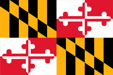
Another addition to all the uniforms appears to be strategically based.  When the Senators moved out of Washington after the 1971 season, the Orioles tried to minimize the tie to Baltimore in order to attract fans left in the baseball vacuum of D.C. by removing 'Baltimore' from the jerseys and emphasizing the nickname as opposed to the city.  Now that The District has a team again, and interest in The Birds has fallen off in their own city, the Orioles are looking to re-establish themselves as Maryland's team.  This is no doubt where the new sleeve patch comes from.  The patches are neither inpiring nor original, as the Baltimore Ravens football club has been incorporating the state flag of Maryland in a secondary logo since 1999.

While the tweaks to the logo are nice, the uniform changes are mostly insignificant. Hopefully it will make a connection with the fan base from a positioning point of view, but on the whole, the update doesn't do much to ruffle anyone's feathers. 

October 18, 2008

Collegiate Critique: University of Kentucky

The University of Kentucky men's basketball team recently unveiled new basketball uniforms.  Designed by Nike, the uniforms draw inspiration from the state's tradition of thoroughbred racing.  The uniforms feature a subtle checkerboard pattern inspired by the racing silks of Secretariat.  This type of integrated fabric treatment is not foreign to sports uniforms.  The Orlando Magic of the early 2000's donned a star pattern and the New England Patriots of the late 90's featured a vertical stripe pattern on similar blue uniforms.  

The one puzzling aspect of the design is the reversed K of 'Kentucky' across the front of the jersey.  It is a distracting design feature, and given that the school abbreviates itself as UK, it seems especially misguided.  Also noticeable is the excessive length of the uniform bottoms, which, combined with the knee high socks, makes the  checkered ensemble start to resemble a Scottish kilt.

Nevertheless, the idea is commendable, especially given that it has historical significance to the area.  Its always refreshing to see teams 'looking back' into history for inspiration instead of attempting to create something that is 'forward looking', which usually ends up involving a bad mix of gradients, 3D effects, and unnecessary clutter.  The design is especially smart because it can be extended to other elements of the UK Basketball brand, as they have already applied the checker pattern to flags and the backdrop for the press conference.  

October 10, 2008

Worst to First In More Ways Than One

A year ago we were looking at the overall worst franchise in baseball.  Worst team.  Worst ballpark.  Worst logo and uniforms.  At least they had managed to get rid of the digusting rainbow gradient that was plastered on the logo and front of the uniforms.  Fast forward a year and we're looking at a team a) beat out both the Yankees and Red Sox to win the American League East division, b) is playing for a chance to go to the World Series, and c) is donning some of the snazziest uniforms in baseball.  

This is classic case of less is more.  While the new identity is not terribly inspiring, it is sharp and on the money.  In a period of excessive 3D logos and angry animals, the Rays kept it simple with a nice, clean, serif typeface.  They showed nice restraint in not using an overabundance of strokes and outlines to 'highlight' the name.  The color choices seem fitting as well.  Two shades of blue reference the water of the bay, with the bright yellow accent to represent the ever-present Florida sunshine.  

This identity program is absolutely one of the most successful rebrands of a franchise in the history of sports.  It coincided exactly with a dramatic change on the field, and officially shed the eternally subpar 'Devil Rays' brand behind.  What was once the laughingstock of baseball is now a franchise that commands respect both on and off the field.  Hopefully this rebirth will generate the interest needed in the Tampa area to build the beautiful stadium that was in the works for the Rays.  

October 2, 2008

Retro Review: Hartford Whalers

The former Hartford Whalers' logo, created by Peter Good, was one of the most clever designs in professional sports.  Introduced in 1979 when the Whalers joined the NHL, its simple, bold forms and use of positive/negative play are typical of 70s era design.  The W initial of Whalers with the back fin of a whale depicted as if sticking out of the water represent the team name in both a typographic and graphic way.  Perhaps the most intelligent aspect of the logo, and one that is often overlooked at first, is the H initial of Hartford which is created by the negative space between the W and the fin.   The rounded illustrative style form is also expressive of the whimsical, lighthearted nature of sports.  Had it been designed today, we'd most likely see some sort of angry animal that appears as if its moving quickly through space.  

While many logos are so generic that they could really be used for a number of companies, this logo is so unique that it could not possibly represent anything other than that sports franchise in that city.  Classy, clever, and fun.  Its a shame the team has been defuct for over ten years now. 

October 1, 2008

"Goodbye Mr. Spalding!"

A letter I actually sent a little over two years ago:

Dear Spalding,

As a lifelong sports fan, athlete, and graphic designer I am highly disappointed in your new logo (the S with the swoosh around it). The first time I picked up a basketball to see that atrocity, I felt betrayed. A company that was once represented by a CLASSIC, timeless, and immediately recognizable icon has decided that it does not want to stand above its peers, it wants to follow the pack and disappear into anonymity. The new logo is neither distinguished, unique, memorable, and its barely legible. On top of that, it is redundant. What is the need for another 'S' right above the word 'Spalding'?

Spalding has a rich 130 heritage that it should be emphasizing. A more appropriate campaign would have kept the tradional mark, which was immediately recognizable to anyone involved with sports. The new NBA ball looks marvelous, but its aesthetic appeal is tarnished by the disgusting mark above the Spalding name. Imagine the beauty and symbolism if it had the traditional circle and diamond instead: a forward-thinking company with 130 years experience in sporting goods: one foot in the past, one foot in the future. Beautiful.

True to the Game, maybe; but true to itself, I think not.

September 30, 2008

You've been... Thunderstruck!

The NBA would like us to think as much, but it looks more like Oklahoma City was struck by the ugly stick.   It is impossible to make sense of any part of this monstrosity.  

What does this shield shape represent, and why are the surrounding strokes not consistent?  The tiny slice of yellow looks like a mistake, as if it was the result of bad registration in a printed piece.  Also puzzling are the swoosh lines that are no doubt supposed to indicate the 'fast-paced' and 'dynamic' nature of Thunder basketball.  However with nothing at the end of the trail, they appear to look more like a pair of chop sticks sitting behind the shield.  There is no relationship typographically between the light, condensed, radially arched THUNDER nickname and the bold, oblique, outlined OKC.  The logo as a whole is vaguely reminiscent of the Cleveland Cavs 'paint splash' logo of the '90s in both form and color.  Also prominently missing is any connection whatsoever to either Thunder or the geographic area which the team will now make its home.  

To me, this logo is a failure in every way.  It is especially disappointing given the amount of time taken to unveil it.  The team played with generic uniforms all summer due to a lack of name or identiy.  The Thunder would have been much better off with a number of the free submissions to Uniwatch's design contest, which produced a suprising number of more interesting and intelligent solutions.

With the excessive controversy surrounding the relocation of the former-Sonics franchise, you'd think that Clay Bennett & Co. would want to do everything right.  However, after seeing this, the people of Oklahoma probably wish the team had stayed in Seattle. 

September 29, 2008

Welcome to Brandball

Brandball is an analysis of sports design. Heavily inspired by other blogs, such as UniWatch by Paul Lukas, and Brand New by Armin Vitt, Brandball puts into the public forum ideas that I have been thinking about myself and discussing with friends and colleagues. I've been interested in art and sports for as long as I can remember, and sports design is where the two interests converge.