
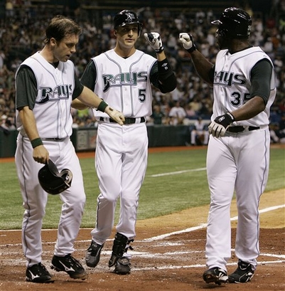
 A year ago we were looking at the overall worst franchise in baseball. Worst team. Worst ballpark. Worst logo and uniforms. At least they had managed to get rid of the digusting rainbow gradient that was plastered on the logo and front of the uniforms. Fast forward a year and we're looking at a team a) beat out both the Yankees and Red Sox to win the American League East division, b) is playing for a chance to go to the World Series, and c) is donning some of the snazziest uniforms in baseball.
 This is classic case of less is more. While the new identity is not terribly inspiring, it is sharp and on the money. In a period of excessive 3D logos and angry animals, the Rays kept it simple with a nice, clean, serif typeface. They showed nice restraint in not using an overabundance of strokes and outlines to 'highlight' the name. The color choices seem fitting as well. Two shades of blue reference the water of the bay, with the bright yellow accent to represent the ever-present Florida sunshine.
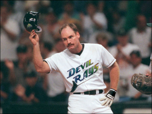
This identity program is absolutely one of the most successful rebrands of a franchise in the history of sports. It coincided exactly with a dramatic change on the field, and officially shed the eternally subpar 'Devil Rays' brand behind. What was once the laughingstock of baseball is now a franchise that commands respect both on and off the field. Hopefully this rebirth will generate the interest needed in the Tampa area to build the beautiful stadium that was in the works for the Rays.


No comments:
Post a Comment